
When coding an HTML email we face numerous hurdles and workarounds that our clients remain blissfully unaware of (unless you don’t address and fix them!). Today I faced an issue where iPhone 7, iPhone 8 and iPhone X were going to render my responsive email designs at 50% of the browser width. Why? I cried. I then did the usual of picking through the code, looking for anything amiss. Nope, nothing. So what was going on…
Litmus tests showed the issue;
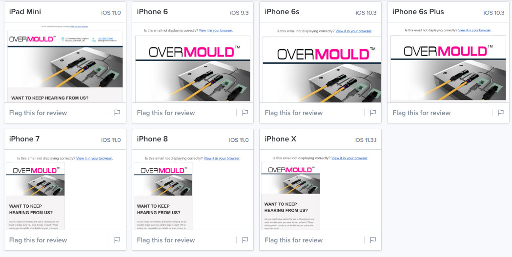
As you can see, iphone 7, 8 and X all render the body of the email at only 50% of the browser.
After much head scratching it turns out the issue was actually the inclusion of a Google Font in the CSS. The first line of my CSS was;
@import url(http://fonts.googleapis.com/css?family=Source+Sans+Pro:400,600);
I can’t confess to know ‘why’, but removing that line solved the issue! 🙂
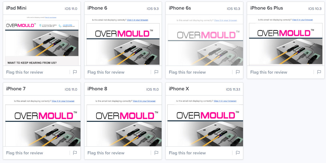
I hope this helps another designer somewhere battling away with the daily minefield of HTML email coding.